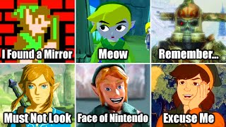
Inventory UX Design - How Zelda, Resident Evil, and Doom Make Great Game Menu UX
Channel: Design Doc
Category: Gaming
Tags: point and clickdoomgame uxfinal fantasyskeuomorphismresident evilinventorywind wakeradventure gameswii umajoras maskuiootputt puttzorktlozmmattache caseux designre4tlozootuxquickwheelking's questhotbarinventory designmoonlightergame designdesigning gamesgood designmonkey islandmario kart horndoom 2016gamepadzeldabreath of the wildocarina of timeitemsbotwultimate doom
Description: Thanks to Squarespace for sponsoring this video. Go to Squarespace.com for a free trial and when you’re ready to launch, go to squarespace.com/designdoc and add code “DESIGNDOC" at checkout to save 10% off your first purchase of a website or domain. Inventories are hardly ever the stars of the show, but that doesn't mean they can be ignored. There's tons of design work that goes into making good inventory UX. Let's talk about the history of game inventory design, from Zork and other point-and-click adventure games through Skyrim and Moonlighter, how Zelda: Ocarina of Time and Wind Waker fixed their hotbar problems with the help of the second screens on the DS and Wii U, and what games like Resident Evil, Monkey Island, and Doom can tell us about how to make inventories feel great. Help support Design Doc on Patreon! It helps us release videos faster: Patreon: patreon.com/designdoc Twitter: twitter.com/Warbot400


