CLAUDE MONET 🌸 failure or success story? 🎨 + watercolor & color pencils painting process
Channel: Lioba Brückner
Category: Howto & Style
Tags: color pencils drawingwatercolorsclaude monetpainting processportrait drawing
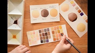
Description: 🎨 Watch the full 2 hours 30 min long step-by-step painting lesson here: patreon.com/posts/aqua-lilium-step-52408249 One of my biggest inspirations is Claude Monet - when I visited his exhibition in Vienna I was stunned how beautiful his waterlily paintings are - and they are giant! 🤯 Since then I think about impressionistic art and I would love to find a way how to incorporate it into realism! (haven't found a good way yet though! 😆 ) ✏️ Materials: Tracing Paper (Amzn US / DE): amzn.to/2VlNe4v / amzn.to/2J3DmG9 Winsor & Newton Professional Hot Press Watercolor Paper: amzn.to/2SuyAaH Winsor & Newton Professional Watercolors: amzn.to/3gxaAvT Winsor & Newton Designer's Gouache: amzn.to/3whhGel Caran d'Ache 40 Neon Colors (Wax-based pencils) (Amzn US / DE): amzn.to/3cy6Qsv amzn.to/3vee5MR Polina Bright Brushes ( 10% Discount Code LIOBA): tinyurl.com/yye85n7b Trekell Brush protégé 7500 round no 2: bit.ly/2O35v1G Luminance Color Pencils (Amzn US / DE): amzn.to/2uNZ4Xa / amzn.to/2JJteDz Shades I often use: Perylene Brown, Light Malachite Green, Light Blue, Anthraquinoid Pink, Burnt Ochre 50%, Burnt Ochre 10%, Naples Ochre, White Polychromos Color Pencils (Amzn US / DE): amzn.to/2uPssf7 / amzn.to/2WtTaoe Shades I often use: Warm Grey I, Warm Grey II, Deep Scarlet Red, Pink Madder Lake, Medium Flesh, Venetian Red, Light Yellow Ochre, Burnt Ochre, Terracotta, Caput Mortuum, Paynes Grey, Dark Indigo, Light Green)